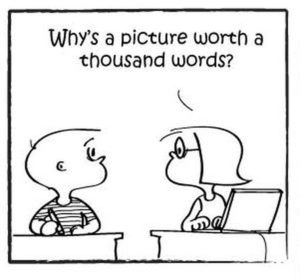
The saying “A picture is worth a thousand words” has been around so long because it’s true. But when I look at the brand strategy behind the websites, social media and content marketing of companies In the B2B space, I often wonder if I missed out on the instructions from a parallel school of thought which taught its graduates, “You should use a thousand words to describe your picture.”
Powerful Branding Images Require Scant Explanation
A common thread running through the best works of art is that it speaks for itself. You might want to read the description next to the painting, but you already know what the work communicates before you start reading.
While touring an art gallery exhibit of Victorian Radicals with my daughter last weekend, I came across a painting from an artist I had never heard of, which perfectly exhibited the transcendence of a powerful image. The title of the painting served merely as a reinforcement of the artist’s intent.

Powerful images need few words to describe them. In the case of this painting, “Work,” the one-word title was enough context.
The image to the right captured a specific time and place without a single adjective attached to it. The title, “Work,” gave the viewer all the context necessary for this 19th Century example of the sights, smells, and costumes of the English proletariat.
After viewing the painting, I read the description next to it to learn more, but that was by choice. I could have easily moved on to the next picture without reading and still had a cognitive imprint.
How Many Words Do Your Brand Images Require?
Here’s a great test to use if you’re a startup launching your first website or if your B2B company is going through a rebrand. Look at each brand image through a storytelling lens and ask:
- If this was the only image on a page, would the reader learn anything about your mission, vision, or values? If the answer is “no,” it’s a secondary image, best used after your brand story is better established, maybe an interior webpage or video B-roll that’s the background for the product’s benefits.
- Could the reader understand the image without any corresponding narration? Don’t get confused between what you’re selling, and why people are buying it.
- How many words would you need to explain the image to satisfy your audience’s curiosity? If it’s more than a handful, the image is better suited for a technical journal or industry publication.
- How many images would you have to use before your reader would understand your unique value proposition? Before and After pictures are commonly understood as a value proposition, but demonstrating a sequence in a series of images tells the reader nothing about why they should care about your product.
Things Are Not Powerful Images
If I had a dime for every B2B company that used an image of its machine or technology front and center, I’d be wealthy enough to own an art gallery. I have two rules about using images of things:
- Nuclear cooling towers, windmills, solar panels, tractors, tanks, VW Bugs, DeLoreans, and video cameras are all iconic images. They require no further explanation. Your wang-doodle, doo-hickey, on the other hand, is not iconic, and until it is, it shouldn’t be the focal point of your brand story.
- People care about people more than they care about things. They want to know how your machine or technology is going to affect their lives positively. That’s why your B2B company should be using images of the emotional connection between man and machine. Whether you used solid steel or carbon fiber is far down their list of priorities and should be buried down the list of images you use accordingly.

Think Like A Painter When Building Your Brand Story
As your company is working on its brand story or re-branding itself internally or with a creative agency, imagine you are curating an art exhibit. Somehow, all of the images you’re using must fit in a narrative cluster that reinforces the previous one.
Before you have professional photos taken or video shot, lay out a series of frames; the large frames in the front for the images that set the table for the rest of the narrative, and the smaller frames for those that support the larger themes you are trying to convey behind them.
You might want to move the frames around to tell a more powerful story, but make sure your visitors see the ones that will resonate with them first so if they wander off to another part of the gallery, at least they’ll remember why they came in the first place.

Arrange your brand story like a painter. Show off your most powerful images in the most massive frames and place them at the front of the exhibit.

